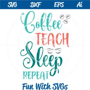
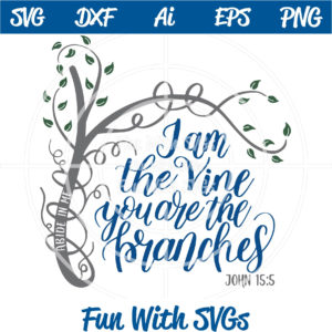
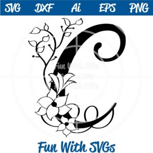
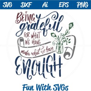
Font Pairing does not have to be complicated. I look around the web and see so much confusion and wordy blog posts concerning font pairing. It is a simple concept and I provide a link to a printable PDF for you below.
However, I would not be doing you any justice if I did not explain a little about what makes up a font. These factors make fonts compatible with each other (or not). The first thing you need to consider when font pairing is whether or not the font is serif or sans serif. As pictured below serif fonts have the little “feet” or endings on the letter a sans serif font does not. Second, we have script fonts that will mimic cursive writing. And third, take a look at all those beautiful hand lettered fonts that are a HUGE trend right now. Keep these ideas in mind when font pairing in the future.

When you consider font pairing for your project, mix them up not only in size and weights, but with serifs and scripts. You want to avoid using two of the same types of fonts in one project. However, if you are utilizing a font family the weights of the font pairing is provided by the font designer. This should help provide you with the variance you need. But always take into consideration what works well for that font family.
Lastly, as you will notice on the PDF (link below), I have tucked words in to each other. This adds much needed interest to SVGs and word art. Please keep this in mind on your next project, I can always tell when someone is new to font pairing. Trust me, I continue to grow in this area as time passes. Also, keep in mind kerning (the space between letters shown above), as “bad kerning” happens and legibility is key (google it, but beware … you may be offended by what you find).
Please feel free to download this printable file and post it near your work station to have it ready when you are designing your next project.
Download printable PDF Font Pairings by Fun With SVGs

