Posted on

What Font Is This?

What Font Is This Image

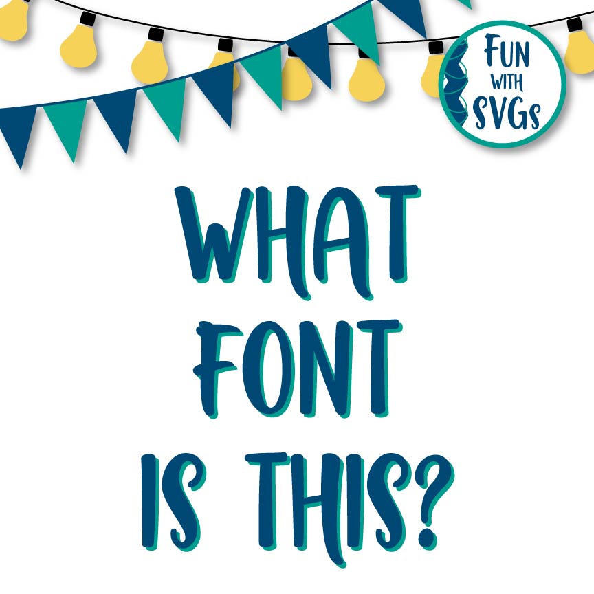
I guess, at least for me, the question of “What Font Is This” bothers me. We all need to identify fonts occasionally, so it is not the question in and of itself. Sometimes we might be trying to match a design we already have, or a client is asking for it specifically. For those reasons I GET IT. But there are websites such as Font Squirrel and What The Font that can assist those of you asking this question. I know some people would rather ask in a group then to do a search on the web yet, Google is our friend and we need to take some responsibility and grow as we learn.

However, I am talking to the person that truly needs to be enlightened by understanding you do not need the exact match, but can find numerous fonts that are similar in nature and will prove to work just as well. If you are a beginner at creating your own files, then please step out of your comfort zone and soar to new heights by collecting your thoughts, imagining what you want your creation to look like and find a font that suits the project. I know this can be a daunting, time consuming task, but the end result will not only please your client(s), but inspire and strengthen you as a designer.  

Of the numerous font sites out there, most of us are trying to save a little money. An excellent choice for FREE Fonts can be found at Font Bundles. Where you can download from a wide variety of hand-lettered, script, serifs and sans serifs. Please register an account from the link above, this will add a few pennies to my account so I can continue to provide fresh, and new svg files for you.

Also, keep a lookout for a new section to be added to my website. I am currently working on 3 new font collections. The first will be named “Journal Notes”, this is a hand lettered font trio by me, with many varieties ranging from thin to bold, sans serif, script and extended with bonus embellishments. The second font, I enlisted the skilled hand of my mother in law, who is a traditional calligrapher. This font “Timeless Traditions” will include the basic letter forms from her, with additional weights and embellishments created by me. And the third font that will be released is by my sisters hand. Growing up she talked endlessly on the phone with friends, during these hours she would practice her hand writing. Our mom would always find out what she was talking about later, as she would glance at her “Conversational Notes” left behind.

I digress, in the end, it really does not matter what font you choose for your projects as long as you and or your client(s) are pleased. So take a leap of faith and CREATE something beautiful.

For more information on font pairing you can read my article and download a printable cheat sheet here.

Posted on

Composition Matters

As a designer, I often see crafters who cut their SVGs and place them on their project without referring to the original photo that is included with the design. Graphic designers are trained in typography and layout. We take the time to ensure that the design is using at least 50% but no more than 75% of the available space.  This allows the eye to freely move and absorb the content of the artwork.

Why does composition matter so much?

  • Composition makes everything easier to navigate through the constant consideration of all the elements in the layout and throughout the design process of any given project.  It’s not just your choice of a font.
  • Composition balances the information with stability and with careful consideration. The elements of design should be taken seriously. Once you understand them, it’s worth thinking about them as guidelines for your creativity.
  • Composition is the first, last, and most important part of your design. It is the broadest and most difficult principle to explain because it encompasses EVERYTHING.
  • Composition uses the Rule of Thirds to pull it all together.  By dividing your composition into thirds vertically and horizontally; where the lines meet should be your focal points. By avoiding symmetry, you add motion and interest. Many artists and designers try to achieve balance in their designs. Balance can be achieved by including dark objects in opposite corners or side of the design. Try this without making it symmetrical; you want to achieve balanced asymmetry.

At some point, I want to walk you through my design process. Part of it is using my imagination, closing my eyes and trying to see it on an object. Yes, I study in my head. But, before I give myself an opportunity to over-think anything, I begin building the blocks of hierarchy. I generally make some quick sketches and through the process I get some rough ideas of what needs to be in the design, and a concept of how I might want to put it all together. These are very fast and very rough sketches. They’re just enough to help me understand where all the elements go, and how they work together. This gives me an opportunity work with contrast issues. Once I get to the computer, I try not to center my focal point, and I just move pieces around until they look good. I’m using my intuition.

There are certain elements of composition that are more important than others, in the sense that you run into them frequently, regardless of your project. Such as; limit your use of colors and fonts, use contrast and spacing to suggest visual hierarchy and think things through by keeping in mind the following:

WHITE SPACE (negative space) – is just as important as the positive space. Do not overcrowd the layout, your eye needs to rest and move on again.

ALIGNMENT – Like an invisible grid use equal spacing, centering, and aligning of objects or text. It is important to make sure your composition does not fall apart. Alignment and spacing makes the layout easier to navigate.

CONTRAST – Visual hierarchy is established by using color, size, and shape, leading the viewer to where they need to begin and where to go next.

CHAOS – Color palette and text style should be used consistently throughout the design. While too many colors and font styles begin to look disorganized and confusing.

Here are my final thoughts, graphic design is not simply “art;” and designers are often asked to do things that goes against what we have learned and know in our hearts to be true of great layouts. Composition matters and the layout serves a very specific function. It is our job to not only provide excellent design, but to influence others of the reasons why we chose the color and composition. The client or market determines the purpose of the design. Then it’s our job to design accordingly.

I love what I do. I have found a community and great friends to share with. I have testers that I am grateful for. They cut my files at a moment’s notice so I can get my product to market ASAP. Identifying and understanding my target market assists me in the process, but it is hard to not have stereotypical assumptions about the demographics of my Facebook group. Facebook is a global community, yet often I focus on the US because that is where most of my customers are. I would love your feedback if you are reading this from another country. What am I missing? what would you like to see more of? Be specific and share your thoughts.

It’s a constant challenge to teach others about principles of design and good practices. Why should they spend a couple dollars to support me and my efforts?  My training, skill, and expertise are worth it! Creating layouts that are appealing on many levels and great customer service are my specialties. I accept the risk of discouragement or theft when my designs are stolen or traced.  Yes, it is challenging because composition matters, but I wouldn’t trade any of it.  I love SVGs and Fun With SVGs is my jam!

Here is another great article on using white space.

Did you see my article on Font Pairings? FREE downloadable PDF cheat sheet.

Coming soon using color and color theory.

Posted on

Font Pairing by Fun With SVGs

Font Pairing does not have to be complicated. I look around the web and see so much confusion and wordy blog posts concerning font pairing. It is a simple concept and I provide a link to a printable PDF for you below.

However, I would not be doing you any justice if I did not explain a little about what makes up a font. These factors make fonts compatible with each other (or not).  The first thing you need to consider when font pairing is whether or not the font is serif or sans serif. As pictured below serif fonts have the little “feet” or endings on the letter a sans serif font does not. Second, we have script fonts that will mimic cursive writing. And third, take a look at all those beautiful hand lettered fonts that are a HUGE trend right now. Keep these ideas in mind when font pairing in the future.

font pairing typography graphic

When you consider font pairing for your project, mix them up not only in size and weights, but with serifs and scripts. You want to avoid using two of the same types of fonts in one project. However, if you are utilizing a font family the weights of the font pairing is provided by the font designer. This should help provide you with the variance you need. But always take into consideration what works well for that font family.

Lastly, as you will notice on the PDF (link below), I have tucked words in to each other. This adds much needed interest to SVGs and word art. Please keep this in mind on your next project, I can always tell when someone is new to font pairing. Trust me, I continue to grow in this area as time passes. Also, keep in mind kerning (the space between letters shown above), as “bad kerning” happens and legibility is key (google it, but beware … you may be offended by what you find).

Please feel free to download this printable file and post it near your work station to have it ready when you are designing your next project.

Download printable PDF Font Pairings by Fun With SVGs

JOIN US ON FACEBOOK